The Vertical Edit: Minimalist Art Staging Logic and Monochromatic Scale
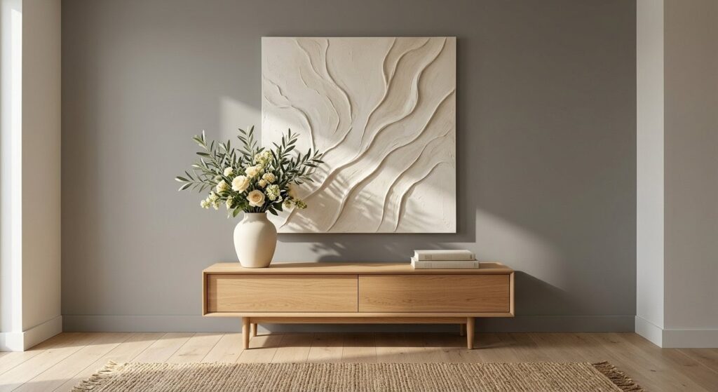
In the Defined Dwelling philosophy, art is not a decoration; it is a structural “fill” for the vertical plane. The goal of minimalist art staging logic is to honor the architecture of the home by providing a focal point that does not compete for attention. When art is too busy or colorful, it creates “visual noise” that distracts a buyer from the home’s permanent value. We prioritize large-scale, monochromatic pieces or mirrors that feel like an extension of the walls themselves.
The Rule of Negative Space: Scale Over Detail
The most frequent error in home presentation is the “Postage Stamp” effect—hanging a small piece of art on a large, expansive wall. This makes the room feel cavernous and unresolved.
- The Logic: We choose one piece rather than a collection of smaller ones. A single large canvas anchors the room’s volume and simplifies the visual field.
- The Buyer’s Take: Large-scale art signals luxury and “completeness.” It allows the eye to rest, rather than darting around trying to decode multiple small images.
Textural Presence: Art as Architecture
Since our goal is to highlight the home, we select art based on texture rather than subject matter.
- Plaster and Fiber: We look for heavy-body acrylics, plaster-relief canvases, or framed textile art in shades of cream, bone, and Stone Grey (#7D7A75).
- The Logic: These materials reflect the architectural lighting logic of the room, catching highlights and shadows just as a wall does.
- The Look: This “tonal” approach ensures the art stays in the background, supporting the modern sofa staging scale and the neutral anchor of the rug without breaking the room’s monochromatic flow.
The 57-Inch Baseline
Even with a massive piece of art, placement is the final “defined” step. We adhere to the gallery standard of hanging the center of the piece at 57 inches from the floor.
- Symmetry: Above a sofa or console, the art should be centered horizontally to provide a sense of formal stability.
- Sightlines: By keeping the art at eye level, we ensure that it doesn’t block the “Architectural Breath” of the ceiling or the flow of the entryway staging logic.
Strategic Restraint
I often advise leaving some walls entirely blank. Not every vertical plane needs a “moment.” By strategically placing art only where it is needed to define a zone, we create “Visual Quiet.” This restraint is what makes a home feel elite—it proves that the architecture is strong enough to stand on its own.
*Commissions may be earned